RGB, Pantone, and CMYK are color systems used in the field of design. Each of these systems has its unique properties and applications, and their use must be considered to create successful designs.
The degree of precision is the key distinction between CMYK and Pantone printing. The Pantone technique is more precise and able to create hues that are more like those seen during the digital design phase. Nonetheless, it is more expensive than CMYK.
Pantone cannot be used with RGB; only CMYK can.
Different jobs can be combined more using CMYK than with Pantone. Each distinct print job requires the equipment to be prepared for a Pantone print job. Hence, it is more cost-effective to use the Pantone system for large print projects rather than for tiny ones.
CMYK and Pantone differ from one another in cost and precision, as well as whether they can be used with the RGB on-screen color model. Red, Green, and Blue, or RGB, are only used for online work. Printmaking is not done with it. Nonetheless, the CMYK printing color process can be applied to RGB.
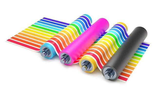
RGB, an acronym for Red, Green, and Blue, is an additive color system used for digital media, such as computer screens, mobile apps, and websites.
RGB color is created by combining varying intensities of red, green, and blue light. The human eye is sensitive to these three primary colors, and the combination of these colors can create a vast range of hues. The RGB color scale is intended for digital device screens such as tablets, smartphones, or laptops. Red, green, and blue are primary colors that, when mixed, create a wide range of derivative colors. If you look at the check, you can see that, for example, the color white consists of three dots placed close to each other – red, green, and blue. Depending on how each of these dots shines, our eyes will perceive a different color.
The RGB system uses a color gamut that covers a significant part of the visible spectrum. It is capable of producing a wide range of bright and vivid colors.
Mixing these three colors will not give us the color black, but white, or rather the absence of color. All you have to do is send an RGB file to print, and you will see that a black crow will turn into a white dove.
Where can the risk occur?
Most often, in a hurry resulting from the fact that the client has developed materials for online marketing, graphics for social media or a website needs to print something quickly. They send these materials hoping that everything is okay. And it isn’t okay because RGB and printing can cause certain problems.
CMYK is a subtractive color system that uses four primary colors: Cyan, Magenta, Yellow, and Key (Black).
It is the standard color model used in the printing industry to create full-colour prints. The CMYK system works by subtracting portions of each color from white light, rather than adding color as in the RGB system. The combination of these four colors can create a wide range of colors, but the resulting gamut is narrower than that of the RGB system. CMYK inks are used to print full-color images, including photographs, illustrations, and text.
When working on a design project, it is important to choose the appropriate color system based on the intended medium of display or reproduction.
We use RGB color digital displays, , while print design requires the use of CMYK or Pantone inks. Understanding the differences between these color systems and their respective gamut is a must to ensure accurate color reproduction across different media.
To achieve color consistency in a design project, need to use the same color system throughout the project. If a design is created using RGB colors for digital display, it must be converted to CMYK or Pantone colors before printing. The conversion process involves mapping the original RGB colors to the closest CMYK or Pantone colors . Careful consideration must be given to the differences in gamut between the systems to ensure that the resulting colors are as close as possible to the original.
While determining which color method to use, one should take into account the variations between CMYK and Pantone. Pantone is a better option for logos and trademarks that are consistent. CMYK is the ideal option for print projects where accurate color isn’t important. All of it is dependent on the print job’s nature and financial limitations. Find out which choice is best for you by speaking to one of our helpful specialists.
Identify the Pantone color references for the CMYK colors in your design in Adobe Illustrator and Adobe Photoshop if that is the case.
Inside of Illustrator, I have four color blocks set up.
There are two red and two orange, and if I click the red one, you can see that there are CMYK color references up here on the right.
Both of the orange blocks are in CMYK format, as are both of the red blocks. What we want to do is convert these CMYK blocks to Pantone colors.
Using Photoshop, you’ll need to speak to your designer if the Pantone applies to you.
Go to edit, edit colors, and recolor the artwork after choosing the color you want. Now, convert to Pantone or find the closest Pantone color reference.
You’ll also see a pop-up window appear here.
Then you should click on the small grid icon that appears here, and select Color Books. Illustrator will launch your Pantone color books.
You should now select solid coated because that is the most popular option. I will do that, click OK, and as you can see, Pantone 186 is now displayed in the box to the right. The closest Pantone color to this red, according to Illustrator, is Pantone 186.
Likewise with the orange.
Adjust colors, recolor artwork, select your Pantone color book, click “yes,” and Pantone 3564-5 will be the closest.
You can see that there is very little color shift between the two.Between the original CMYK, and the new Pantone if we overlay these colors.When switching from CMYK to Pantone, this is one of the things you must accept. The color match might not be exact.
There might be a color discrepancy, but it is just something you have to live with. They are fairly near if you divide them apart once more.
Photoshop by Adobe.
As a logo designer, I usually tell that your logo be created in Illustrator as a vector file. Besides, it’s possible that you just have a bitmap version of your logo, such as in a jpeg or a png, and you’ll still need to know what the Pantone color references are.
I have the four blocks we had in Illustrator, but they are constructed differently in Photoshop.
You must use the dropper to choose the color of the block to determine the Pantone color reference. Up here, in the right-hand panel, if you double-click on the color block, it will open the color picker. Then, click on color libraries to access your Pantone books. You can see here that Pantone 186 was selected as the closest match, just as it did in Illustrator. This is how you can determine the Pantone color reference in Photoshop.
And just to go over that once more in Photoshop.
To quickly determine whether and how much of a difference there is between the two colors. We’re going to use our color picker to select the orange, double-click, and then choose color libraries. As you can see, it tells us that this is the closest orange up here on top; below it is the original CMYK.